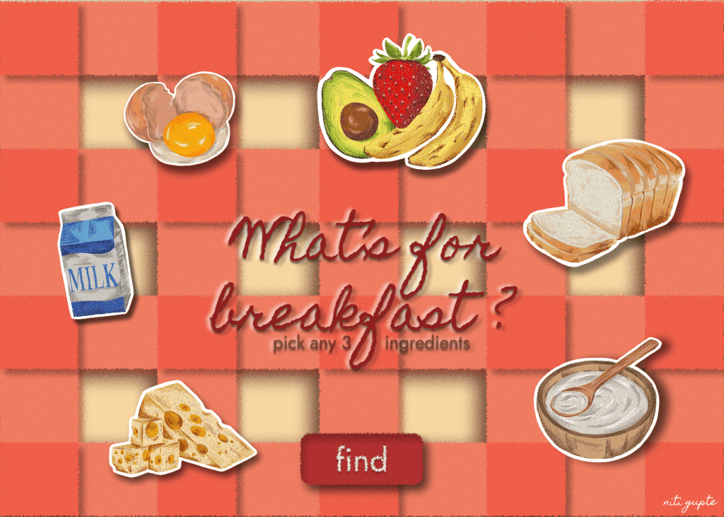
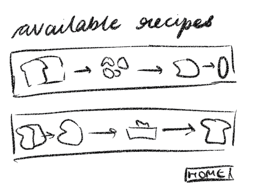
An interactive website that helps users decide what to make for breakfast by generating personalized recommendations based on ingredients they already have.
I. The Problem
Many people struggle to decide what to have for breakfast. Busy mornings, limited ingredients, and an overwhelming number of options often make it difficult to prepare a healthy meal. As a result, people may skip breakfast altogether or repeatedly resort to the same meals.
Design Challenge
How can we help users quickly decide meal options using ingredients available to them?
II. Research
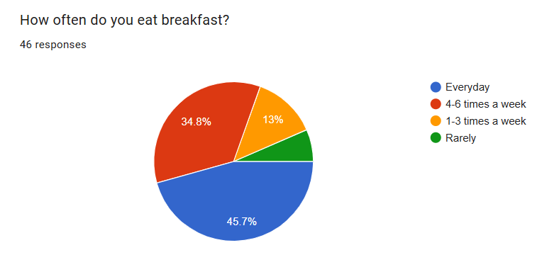
A survey was conducted with over 40 participants. Questions relating to meal plans, breakfast frequency and other such habits we asked in order to detect a pattern.
Findings and Insights
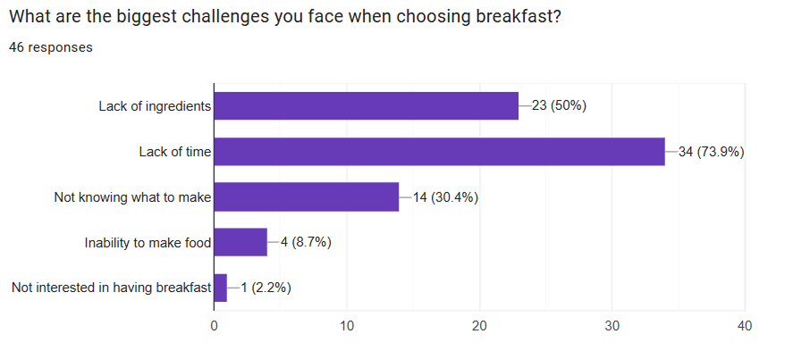
The most common challenge faced by the participants in choosing breakfast was- lack of time.
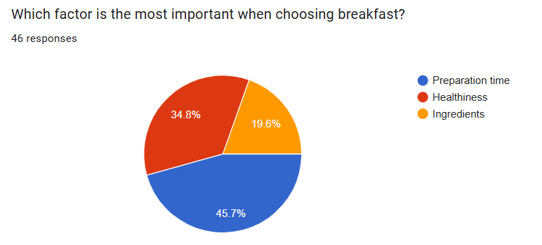
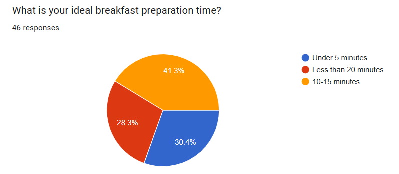
The survey showed priority given to time taken for preparation of meals as the most important factor when choosing meals.
Other questions
Time in all aspects showed a trend of being at the highest priority.
People catering to families prefer meals that are easily servable.
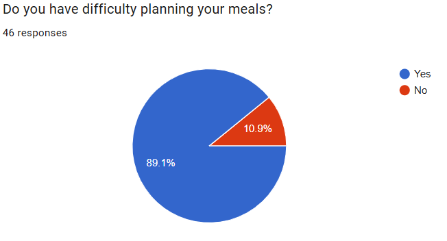
A vast majority of people have a hard time planning meals.
Over 90% of the participants would benefit from a platform that helps them in the meal planning process.
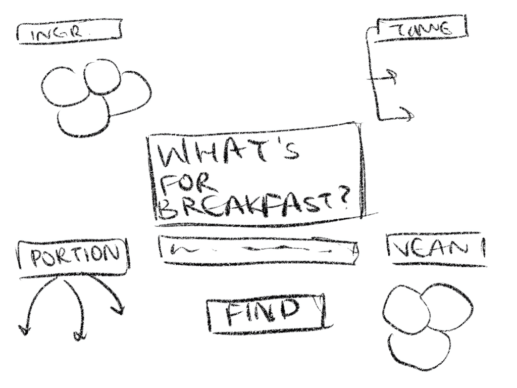
III. User Flow
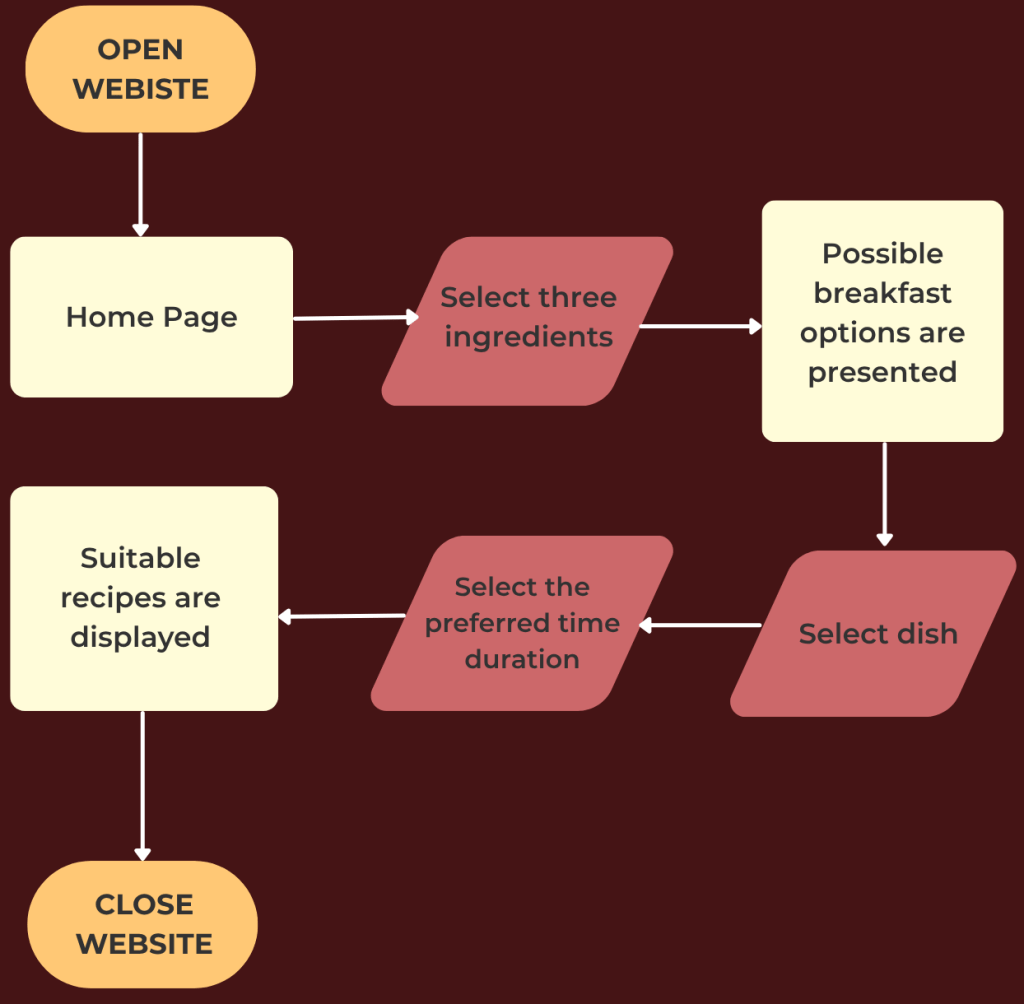
After a few iterations, I created the final user flow. Through this website I aimed to make it as unrestrictive as possible. By using the data I received in the survey and observing patterns, it was evident that time was the priority for most. I decided to go ahead with a single filter- “Time” while still maintaining flexibility in receiving meal suggestions. With an easy to navigate and simple UI, I aimed to create a fast decision maker that people could use in a matter of seconds.
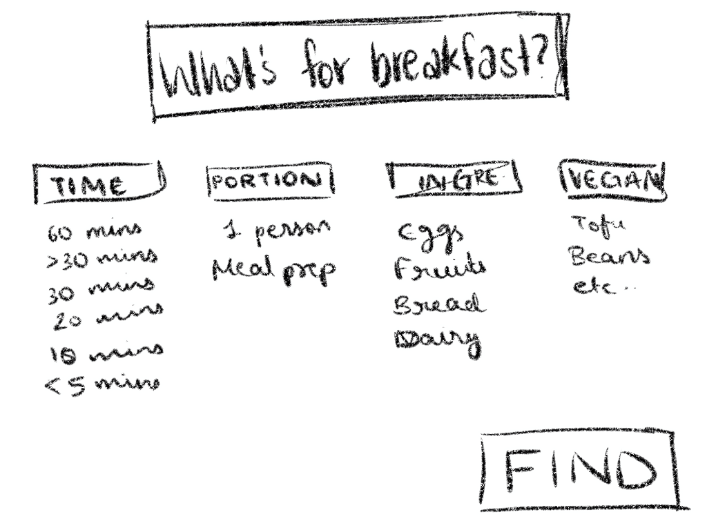
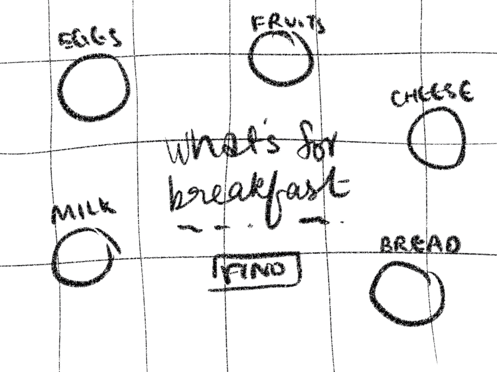
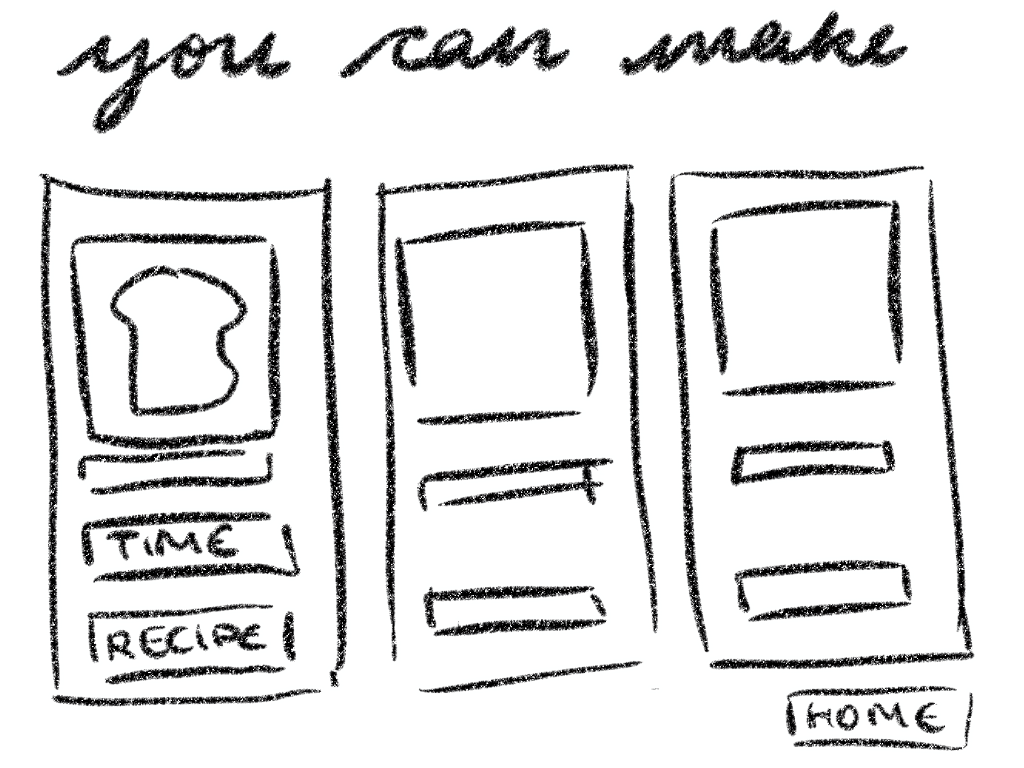
IV. Wireframe Iteration and Final Layout
Inital Wireframes
These were my initial layout iterations. After working on them and coming up with alternative layouts, I came to the realization that it complicates the process by including a large number of filters and sub-filters. The target audience of this website would prefer something simpler and easier to navigate which is why I decided to reduce the number of filters and not have them on the home page itself.